Attention: As of January 2024, We have moved to counting-stuff.com. Subscribe there, not here on Substack, if you want to receive weekly posts.
All things considered, I’m not a particularly big LEGO fan. I’ve got a few pieces decorating the house and think they’re awesome toys for the kiddo, but don’t build original models of stuff nor think about huge array of blocks that have been created over the many decades. But last week, I stumbled upon this post by BrickNerd about how they put together an updated 2023 color palette for LEGO bricks.
They decided to do this because there had been four brand new colors and one color brought out of retirement since the publication of an official 2016 color palette. As part of their goal to create a new palette document, they wanted to make sure the colors on the document were as close to the actual color. The reason for this was because various LEGO fan sites that either archive LEGO data or enable trading of bricks all differ in how they present the colors on their web sites. The RGB values vary a surprising amount (there’s a graphic on the post about it which is worth checking out).
What’s fun about the post is they plotted the colors from the sites on a plot of Hue versus Lightness on the HSL scale (Hue-Saturation-Lightness, a way of specifying colors much like RGB). The colors sites use sorta cluster, but can be pretty spread out. Obviously the solution for the color palette was to not trust any of these colors and to start from scratch.
The method that the author decided to use to create their new palette document was as follows: Buy PANTONE swatches, then physically compare bricks to the colors on the swatch, and then use the most similar color as the one for the palette. For any color scientists reading, the author is well aware this is a very flawed method but figured it is close enough for purpose.
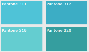
Huh? What’s PANTONE? PANTONE is a company/trademark that publishes a system for communicating colors and is often used in the publishing/manufacturing industry (there are other competing systems too). They have standardized formulas for pigments and coatings and make lots of swatches and color books with all sorts of colors with names. If you wanted to specify a certain shade of blue for your logo, you pick the color you want out of your swatch, say Pantone 311, then when you communicate to your printer or swag producer, you can tell them to make sure the logo is Pantone 311. Everyone uses the same sets of books produced to the same manufacturing tolerances, so this lets people reliably communicate color without having to worry about how particular screen settings, lighting conditions, different printing media, will affect things.

PANTONE makes quite a bit of money off this whole system because the color materials on the swatches will fade/change over time, so it’s recommended to refresh them every year or two.
Now that we’ve gone through all this exposition, we can finally talk about what had grabbed my attention this week. The measurement of color!
Color science is HARD
Normally, when I write one of these “How do people measure stuff?” posts, I spend a couple of days to do background research and can come to a decent enough understanding to write. This is not true for measuring color. This rabbit hole is ridiculous. I see no bottom. People devote careers to this. I’m just doing my best to not mischaracterize things too badly.
To jump to the conclusion, there are two types of devices that measure “color”, depending on exactly how you’re defining color and what you’re doing. First is a colorimeter, a device that has uses three photosensors and filters and uses models to imitate the perception of color in humans. The second is a spectrophotometer, a device with LOTS of sensors (as many as 40+) that measure the amount of light reflected/transmitted at specific wavelengths, essentially profiling the spectrum of light the object gives off. If you want to know a bit more, this goes into a bit more detail.
If the thought about measuring color wasn’t setting off alarm bells in your head, the fact that there are two separate specialized tools for measuring color-like stuff should.
The reason for this is because color is a subjective phenomenon. It’s the result of our brains processing signals from the three different types of cone cells in our eyes. There’s a phenomenon called metamerism where two objects can appear to have the same color under daylight but appear different under fluorescent light that has a different spectral balance. This is because our eyes can’t tell the difference between a single wavelength of light versus a mix of other color wavelengths that happen to stimulate the cones of our eyes in precisely the same way. This fact also allows our RGB pixel screens to show lots of colors despite only having three primary colors.
This is where we get the split of two different color measuring tools. Colorimeters try to simulate our eyesight by using three sensors tuned to the wavelengths our eyes see, plus mathematical models of human color perception. (We’re going to ignore the rare tetrachromat who have a fourth type of cone and superhuman color perception.)
Meanwhile, spectrophotometers are devices that specifically measure the wavelengths coming from an object, the “spectral power distribution”, and thus are more “objective” in a sense. A human may not be able to perceive the differences between measurements, but they’re definitely there. These do related, but distinct, jobs and you can’t substitute one for another. One tells you what color a human will perceive the color as, while the other will tell you what sort of light is actually being put out.
The CIE 1931 color spaces
So how do colorimeters and such model color perception?
It starts with the basic assumption of an additive color theory of light, which most of us learned in grade school as how the primary colors of red, green, and blue can be added to each other to form any color. Truth is, different sets of red/green/blue can be considered primary so long as they add up to the correct colors. They’re considered “stimulus” colors because what’s important is how the wavelengths stimulate the cones in our eyes, regardless of whether it is a single wavelength of light or some mix. A color is defined as the degree of stimulation of all the cones taken together, regardless of the specific light components. We’re going to leverage the fact that metamerism happens to allow us to recreate the sensation of colors that aren’t actually present.
Back in the 1920’s two researchers, William David Wright and John Guild, independently did experiments where they would show subjects a color and have them dial in a mix of primary colors to reproduce the colors. These experiments provided the data needed to map out how human eyes combined primary colors of 700nm, 546.1nm and 435.8nm to match all sorts of colors. The later two wavelengths were picked because they’re common emission spectra of mercury. The 700nm was picked because apparently our eyes have trouble distinguishing differences up near the top of the visual range (roughly 380nm to 750nm), so it was “good enough”.
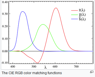
The data for the 17 subjects between the two researchers agreed enough that it was used by the International Commission on Illumination (the CIE, because it’s a French name) to model a standard observer looking at a color filling 2 degrees of vision (the roughly size of the fovea where our color vision is most acute, about the size of your thumb at arms length). That standardized eye’s conception of a color is modeled by a “color matching function” — that is to say, the subjects were asked to match a pure color wavelength with a mix of primary color wavelengths.
One interesting aspect about color matching functions is that you might notice that some colors on the graph take on a negative value at times. This is because 3 primary colors can’t reproduce all the colors of the full spectrum. So to match a specific wavelength of light in the experiments, the subjects would wind up bringing one color (often red) to zero, and it still won’t be enough. The researchers then cleverly put extra colored light on the object until the resulting color matched what the subjects could dial in.

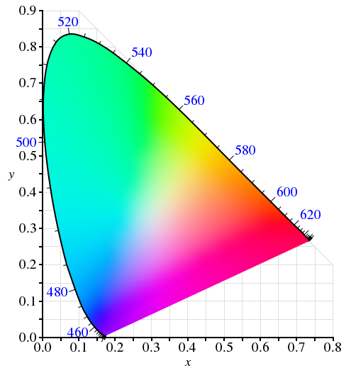
The color matching functions are then used to calculate the coordinates of every color that a human can perceive when held at a constant luminosity, which yields those funky fin-shaped rainbow diagrams we can sometime see when talking about color spaces. You can take any point in the diagram and just change the proportion of the other primary colors to move to another color. It’s a simple linear transformation.

Up until now, with the exception of the colorful diagram above, I’ve been describing what’s called the CIE RGB color space. It’s the range of colors based off the r, g ,b measurements made by Wright and Guild. The problem is that since there are negative values in the formulae that made calculation tricky at the time, CIE created a linear transformation of the CIE RGB color space to make all the values positive. This all-positive color space is known as the CIE 1931 XYZ color space.
And with that, we finally have a map of “the mathematical range of colors that a human can possibly perceive”, we also get a coordinate system using tristimulus values of x, y, and z, that uniquely identify a specific color in human perception.
I’ll also note that people figured all this stuff out before computers were invented. Turing’s “On computable numbers” was published in 1936. They did all this with with actual lamps, filters, manual data collection, and manual computation with stuff like slide rules.
Putting CIE 1931 color spaces to use
So why did I spend all those word describing the buildup to a colorful shark fin? Because it forms the empirical ground upon which much of the color technology we use today stands on. The CIE XYZ color space allows models of color reproduction to be built upon it. Over time, refinements of CIE XYZ would be developed to address shortcomings and new needs, like CIE L*a*b*, but it is still in use to this day in places like the ICC profiles that our computers use to transmit and display colors. There are also transformation functions between color spaces, so they all effectively substitute for each other in many ways.
Meanwhile, other color spaces that you’ve probably heard of like the sRGB standard that’s the basis of web colors and many computer displays, and other color spaces like AdobeRGB, all define their primary colors as specific tristimulus points within the big CIE 1931 XYZ space’s coordinate system. Those three points form a triangle, and inside the triangle is the full gamut of that color space — all the colors that standard can possibly represent by mixing various proportions of its primary colors.
So now that we have all these mathematical functions and standards that all interrelate to each other by mathematical transformations, we can always convert a color from one standard into a color in any other standard (or the nearest one if its outside the gamut).
Thus, colorimeters can use their three photosensors that are factory tuned to specific wavelengths of light and reference light source that are all unlikely to fit the exact color standards due to manufacturing realities. It’ll treat those as primary colors, add them up to arrive at a color based on the manufacturer’s calibration settings. That process will yield a coordinate in a color space like CIE 1931 XYZ or L*a*b* or similar. Then it can further transform that color into the desired target color space in question like sRGB and display it to the user.
FINALLY, after all this, the device we bought off the internet can tell us what color a particular LEGO brick we bought is supposed to be.
If we even remember why we were looking at LEGO blocks at the start any more…
References
Here’s a dump of some of the more useful things I was reading while trying to hack this together
YouTube video of how the new Matplotlib default colormap was designed (thanks person on the Discord for sharing this with me!)
A nice writeup about color spaces, including many diagrams of the color matching experiments done as foundation for CIE XYZ
A writeup about “delta E” which a measurement of the difference of two colors, which I stumbled upon while trying to understand why NIST’s discussions about color sometimes mention a specification of “ΔE*ab < 0.5” and had no idea what it was
If you’re looking to (re)connect with Data Twitter
Please reference these crowdsourced spreadsheets and feel free to contribute to them.
A list of data hangouts - Mostly Slack and Discord servers where data folk hang out
A crowdsourced list of Mastodon accounts of Data Twitter folk - it’s a big list of accounts that people have contributed to of data folk who are now on Mastodon that you can import and auto-follow to reboot your timeline
Standing offer: If you created something and would like me to review or share it w/ the data community — my mailbox and Twitter DMs are open.
Guest posts: If you’re interested in writing something a data-related post to either show off work, share an experience, or need help coming up with a topic, please contact me. You don’t need any special credentials or credibility to do so.
About this newsletter
I’m Randy Au, Quantitative UX researcher, former data analyst, and general-purpose data and tech nerd. Counting Stuff is a weekly newsletter about the less-than-sexy aspects of data science, UX research and tech. With some excursions into other fun topics.
All photos/drawings used are taken/created by Randy unless otherwise credited.
randyau.com — Curated archive of evergreen posts.
Approaching Significance Discord —where data folk hang out and can talk a bit about data, and a bit about everything else. Randy moderates the discord.
Support the newsletter:
This newsletter is free and will continue to stay that way every Tuesday, share it with your friends without guilt! But if you like the content and want to send some love, here’s some options:
Share posts with other people
Consider a paid Substack subscription or a small one-time Ko-fi donation
Tweet me with comments and questions
Get merch! If shirts and stickers are more your style — There’s a survivorship bias shirt!


I've worked in print my whole life. Not a true "color scientist" but I have all the same certifications.
This post was a fun read and you certainly get a passing grade :D
You did get to ignore one whole dimension which is the most annoying of all - substrate. The substrate you are printing on dramatically changes the color. The difference between the Pantone book paper and the lego plastic should show this off to some extent. (Coated paper would simulate plastic somewhat reasonably).
Great job :D
Glad you liked the Matplotlib video!
One note: did you mean 680 nm to 750 nm, not 380 to 750?