

Internalizing baselines is hard
Internalizing baselines is hard
Most of us probably don't even work at it

Attention: As of January 2024, We have moved to counting-stuff.com. Subscribe there, not here on Substack, if you want to receive weekly posts.

Last week, in the ongoing slow(?)-motion train crash that we call Twitter announced that free access to the API will end, even for low volume users. People will have to pay some to-be-announced fee for access. (And LOL, it’s already being partially walked back, there’s no keeping up with this). It’s ostensibly an attempt at limiting bot activity (we’re going to just ignore the existence of endless browser automation tools and human-powered click farms), but many have noted that tons of useful good bots from developers are going to be abandoned if forced to pay.
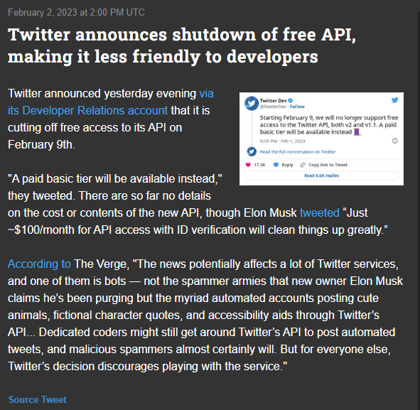
My initial reaction to this was essentially laughter, since it was obvious that it’s not going to generating any meaningful amount of revenue because the vast majority of people who are using the API are not going to be willing to pay any sort of money to continue using it. In fact, my baseline assumption is that maybe 1%, of active dev accounts might be willing to pay even just a token amount. The real number might actually be lower considering that large companies who needed high volume API access were paying for it already, so the only people left on the free tier are hobbyists and small businesses that don’t need that sort of volume and probably don’t derive much revenue from it — both of which are groups that are unlikely to recover the cost of an API fee via other means.
Meanwhile, I’m sure bot farms are gearing up their web scraper scripts to simply ignore the issue as the game of cat and mouse continues. Whatever. We have actual data things to think about.
Baseline assumptions
As I mentioned, I have a baseline assumption of 1% conversion for this scenario, and its these base assumptions that I want to write/muse about today.
First, I use 1% as my starting point for situations where I need to convert an otherwise happy user of some kind of free service into doing something very difficult, typically involving pulling out a credit card and paying money. For example, the conversion rate of subscribers to paid subscribers in to this very newsletter is almost exactly 1%. If we were to borrow Bayesian language, 1% is my prior distribution for these sorts of scenarios.
Obviously, it doesn’t just blindly apply everywhere. Many years ago at the end of an interview at Facebook, someone asked me what I thought the usage rate for the “say happy birthday to your friend today!” feature was and I said 1% was my default assumption for prompts, and they laughed saying it was probably in the 20-30s%.
Much of this prior is built up over years of working on projects that tried to get users of a free product to do or buy something involving paying. While everything could be improved and tuned with time and effort, most efforts would start life off in the single digits of conversion unless they were somehow “easy” for the user.
I’ll then scale my assumptions based on various factors, mostly related to how much friction is in the user’s path. For example, if I were to send a newsletter out that has some kind of compelling call to action that’s still free, like “click here for a free conference ticket!”, I might expect an order of magnitude improvement to 10%-ish. If I wanted people to take a survey, and I was offering cash payment incentives I might expect to get 15-30% depending on how much I’m offering. Other factors like “relevancy of the message to the audience” will also play into my initial guesstimate. But in broad strokes, things can be characterized as “single-digit” versus “double-digit” conversions.
The nice thing about having some pocket baselines
It’s far from an exact science, but having a baseline in my head gives me juuuuust enough calibration so that if I see a number that is way outside those expected ranges, I’ll be surprised at how good/bad the result is enough to be suspicious of the results.
Since one of the most common questions a data scientist will ever get in the context of a metric is “is this good or bad?” I can use it to provide some context when no other context is available. For example, if a short survey goes out and we see 5% response rate, that seems off and work some examination. Meanwhile, if I saw that we were managing to convert 40% of free users to paid users, I’d be freaking out for all sorts of reasons because that’s way outside my prior experiences. Either situation is a strong push to try to figure out if there is a weird bug lurking within the system.
I’ve lost count of the times where digging around these wonky results yielded bugs that have completely ruined experiments before.
In fact, the previous paid post about the fraud lawsuit where a bank bought a startup essentially for their customer list started suspecting something wasn’t right when they ran a test marketing campaign to 400k users and got back a dismal 1.1% open rate instead of the roughly 30% the bank was used to for their own internal marketing efforts. It was so out of line, people started asking pointed questions that exposed the whole scheme.
Incidentally, my internal baseline for open rates is in low-mid double digits, so 10-30%, biased towards being lower since I apparently worked on very spammy products. This newsletter consistently enjoys a 30-40%+ open rate throughout the years and I’m always amazed by that fact.
Another nice things about these baselines is that it gives you a rough expectation of the range of improvement for a metric. On a good product, you might be able to refine things to take a 1% conversion and maybe bring it up to 5%, or possibly even 10% with a ton of work. It’s probably impossible to take it to 25% without some very big and visible change being made. Sometimes, that information is enough to tell you whether it’s worth the trouble investing into working on something or not.
But you need to remember these assumptions aren’t easily generalizable
Like with the example I had from Facebook’s birthday feature, you can’t just blindly apply a baseline to all situations without thinking them through. 1% was a pretty ridiculous (and very conservative) guess at the usage of a feature where users both enjoy sending and getting such messages. But I’m sure that there were other calls to action available that did only get 1% interaction due to things like page design and utility to the user.
The hard part is building that sense of “this situation is similar enough to past situations” to give the baseline assumptions a reasonable chance to be in the right ballpark. Despite having a brain that’s pretty obsessed about finding patterns, it’s not very good at the moment I step outside of certain industries.
For example, I’m used to sending out surveys that get 1-5% response rates from users because we rarely have the budget to incentivize (read: pay) people to respond and don’t have finely tuned subject lines or lists of engaged users. Meanwhile, the marketing and research folk who do surveys for a living would probably scoff at those numbers because they have a much more refined way of getting respondents, both from having a better pool of people to send things to, and knowing how to craft campaigns to maximize response.
If I were thrown into such a situation, I might be happy with a 4% response rate because I don’t know any better and it jives with my baseline, while someone who does know better might only be satisfied if they get 8% under similar conditions. Being overconfident can be very dangerous and can put you on the same level as an over-fitted AI bot.
Building baselines would be easier if we were intentional about it
Many of us don’t consciously build up baselines. It’s just something we develop as we go about our daily work and see a constant stream of examples. Once you do twenty similar experiments and the results are always in a tight range of values, you start to remember. But considering that we’re the DATA people, it’s a ridiculously inefficient way of doing things.
Instead, what we SHOULD be doing, is good basic recordkeeping. If you wrote down on a sheet of paper the results and summary of conditions of every campaign/experiment/whatever down on a piece of paper over the course of a year, I’m positive that you’d start seeing patterns. Give it a couple of more years and context and you can probably have something to work with.
Then, if you ever change jobs, you take that information with you to the next place, and compare and contrast how things go in the new place. Also, if you ever talk to other data folk at a conference or something , you can compare notes about things.
It seems simple but I’ve personally failed multiple times in doing. Often it’s because something comes up that distracts me from remembering to keep notes, or there’s no good stopping point in the workload. But more troublesome is that the sheer variation of experiments we’re asked to do as data scientists make it a tricky affair to keep useful records. One week it’s an A/B experiment for a new global feature, the next month it’s a survey, a few days later it’s a banner only shown to people in a certain country during a holiday. It’s a challenge to keep all these details straight and sensible while knowing what to write concisely for future reference. It’s very much a coding/classification problem where it’s not clear what details you need to write down before you do your final analysis.
So, I guess we gotta analyze or own experiments…
OK OK, so if you’re like me and hopelessly incapable of keeping decent notes in real time, then the only solution is to make a project out of it. Hopefully there’s saved records and presentations of old studies that let you go back in time and reconstruct the details of what happened later.
You did keep records and good descriptions, right? And stored everything in a way where you can find most of them years later?
Yeah, me neither.
I’m decently organized about work paper trails, but filing things in a way I can dig them out over years is not a skill I’ve gotten good at still.
Anyways…. this is why most of us only have vague priors about common situations and not well documented evidence. I’m sure the more organized folk out there are rolling their eyes at me right now.
If you’re looking to (re)connect with Data Twitter
Please reference these crowdsourced spreadsheets and feel free to contribute to them.
A list of data hangouts - Mostly Slack and Discord servers where data folk hang out
A crowdsourced list of Mastodon accounts of Data Twitter folk - it’s a big list of accounts that people have contributed to of data folk who are now on Mastodon that you can import and auto-follow to reboot your timeline
Standing offer: If you created something and would like me to review or share it w/ the data community — my mailbox and Twitter DMs are open.
New thing: I’m also considering occasionally hosting guests posts written by other people. If you’re interested in writing something a data-related post to either show off work, share an experience, or need help coming up with a topic, please contact me.
About this newsletter
I’m Randy Au, Quantitative UX researcher, former data analyst, and general-purpose data and tech nerd. Counting Stuff is a weekly newsletter about the less-than-sexy aspects of data science, UX research and tech. With some excursions into other fun topics.
All photos/drawings used are taken/created by Randy unless otherwise credited.
randyau.com — Curated archive of evergreen posts.
Approaching Significance Discord —where data folk hang out and can talk a bit about data, and a bit about everything else. Randy moderates the discord.
Support the newsletter:
This newsletter is free and will continue to stay that way every Tuesday, share it with your friends without guilt! But if you like the content and want to send some love, here’s some options:
Share posts with other people
Consider a paid Substack subscription or a small one-time Ko-fi donation
Tweet me with comments and questions
Get merch! If shirts and stickers are more your style — There’s a survivorship bias shirt!
Re: 30%+ open rates, I recently worked on an integration with an email vendor and learned that ios email clients will auto open emails in the background, which will trigger an open event. In apple’s case, it’s intentionally to obfuscate user data. This particular vendor seemed to just be ignoring any opens from these clients to calculate some ridiculously inflated open count. I’ve observed through a friend’s substack that they (at least as of a year ago) count those background refreshes as opens. So definitely a 1% open rate would signal an underlying issue with the email list, but open rates don’t represent real human opens anyhow.