

It’s OK to use spreadsheets in data science
It’s OK to use spreadsheets in data science
Because they’re awesome in a bunch of messy data science contexts.

Because they’re great in a bunch of messy sub-optimal data science contexts.
With all the great sophisticated data tools that exist out there these days, it’s easy to think that spreadsheets are too primitive for use in serious data science work. The fact that there’s literally 20+ years of literature cautioning people about the evils of spreadsheets makes it sound like a “real data professional” should know better than to use such antiquated things.
But it’s probably the greatest Swiss army chainsaw for data for the sorts of ugly work that no one ever wants to admit they have to do every day. In an ideal world they wouldn’t be necessary, but when there’s a combination of tech debt, time pressure, poor data quality, and stakeholders who don’t know anything but spreadsheets, they’re invaluable.
Spreadsheets have a bad rap, it’s quite well earned
Long before the field of data science was ever a thing, tons of articles have been written touting the various flaws of spreadsheets thanks to its position as among the most ubiquitous programs in business. Horror stories abound. There’s instances of spreadsheet errors leading to significant errors in academic work and papers delving into all sorts of spreadsheet errors. There’s even a whole “European Spreadsheet Risks Interest Group (EuSpRiG)” (founded in 1999!) that’s dedicated to Spreadsheet Risk Management a.k.a. how not to ruin your business via spreadsheet snafu.
Many of the issues stem from human foibles. It’s too easy to make a formula error or change a formula in a way that goes unnoticed. Occasionally there are issues with the actual output of various functions (the stats functionality built into Excel had such issues since 15+ years ago, some may persist). Sometimes sheets just explode in complexity and it’s downright confusing.
There’s already plenty of features to guard against a lot of the human failure points, but humans being as they are don’t usually have the patience and forethought for that sorta thing. Sure we can use cell protection, locking, validation, etc., but like taking backups of your data it’s often put to the side “for later” and never actually happens.
The majority of other issues is when people attempt to make a spreadsheet do too much, like becoming a database, data warehouse, project management tool, when more powerful and user-friendly dedicated solutions exist. It’s easy to say “use the right tool for the job” but usually spreadsheet monsters start out as small jobs and grow into something… more.
All these issues are very valid. I’m going to take those as a given. All it means is that you need to be aware that a good tool can be misused in horrible ways. Instead, I’m going to move on to where spreadsheets are still pretty sweet to have in your back pocket.
“Spreadsheets for EDA? Cool.” — Everyone
Most practitioners I’ve spoken to agree that using a spreadsheet in exploratory/prototyping way is totally fine to do (they might not do it themselves, but they don’t see much wrong with it). You’re typically messing around with a small sample of data to figure out what is possible. There’s little expectation that you’ll be producing refined code or analysis at this point. Depending on your familiarity with Excel, Google Sheets, or Libreoffice vs pandas and R, you might even be able to work faster.
I’m really obsessed with being familiar with my data sets before I build out an analysis or write code. Sure, you can look at descriptive statistics, but they can lie to you, a lot:
Such an awesome animation
The only real way to get a good sense of the data is to look at distributions, visualizations, and directly sampling it in raw form. Spreadsheets are generally great for this. I tend to find it less clunky than using pandas to poke around at arbitrary chunks of rows.
The key feature is how quickly you can experiment with data transformations in a spreadsheet. A quick VLOOKUP will let you test a simple join between two messy tables to find the broken or duplicate keys. You can toss data into a pivot table in a few keystrokes and clicks and check out certain aggregations. A lot of bugs can be spotted this way because you’ll attempt a simple bit of arithmetic, it breaks because of wonky data, and you can quickly examine what actually happened and add it to your list of data errors to clean out.
Similar operations in pandas, while also quite easy, takes more typing and keeping details straight in your head as to what functions have been applied to what, etc. So the ideal case here would be to use a spreadsheet to explore, prototype out what data transformations you want to apply, check some distributions, then go and code up a proper model in Python or R now that everything’s clearer in your head. The trick to know when to stop is if you’re seriously considering writing a macro or something, stop.
Dealing with ridiculous semi-repetitive coding
Tracking systems are FULL of arbitrary combinations of arbitrary strings and numbers that you need to query against to count. Maybe there’s an underlying pattern that works for your use case that let’s you meta-program something, or maybe not. This is especially an issue for systems that have multiple people over the years adding/changing various tracking codes with different naming conventions, even different back-end stacks.
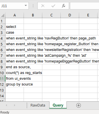
An example of a typical tracking system that’s had a few years to grow production cruft
Many times, there’s no other way to deal with data sets like the above other than writing some kind of brittle hard-coded mapping function of some kind. It’s honestly a challenge to keep everything consistent and documented over years of production, the mix of camelCase and underscores points to that. Doing a simple aggregation for meaningful analysis is an utter pain in the butt.
-- ProductLead: "Where do my registrations come from?"-- Analyst: "Why do you hate me?"select case when event_string like 'navRegButton' then page_path when event_string like 'homepage_register_button' then 'homepage' when event_string like 'newsletterRegistration' then 'newsletter'when event_string like 'adCampaign_%' then 'ad'when event_string like 'homepageBiggerRegButton' then 'homepage'end as source,count(*) as reg_startsfrom ui_eventsgroup by sourceComing up with that giant case statement like the above is a pain, keeping it organized is even worse. I call it semi-repetitive because if it were actually repetitive, you’d be able to write a function that would capture its behavior fairly easily. This one has a bunch of stupid custom edge cases because of tech debt, so it has undesirable Kolmogorov complexity . Enter using spreadsheets to keep things somewhat sane.

Sometimes you gotta break some eggs to make a registration source tracker
Is this ideal? Probably not. But I’m not even sure what the ideal actually looks like in this situation. The alternative would be to hard-code all this into Python for analysis which is just as brittle at this mess. A cleaner solution is to somehow refactor how your tracking codes are set up past, present, and future and create a system that prevents this from happening, but I’m not smart enough to envision such a system that won’t be abused by some future use.
Sharing packaged data with less technical folk
There’s a reason why lots of BI tools of all levels have a kind of “export to CSV/Excel” feature. Lots of very smart analytic people don’t know much about coding in Python or R. They’re not going to look at a notebook of code and go “Aha! Let me make some tweaks to check my own hypothesis.” But, if you hand them a table of fairly cleaned up data, they’ll handle themselves quite well.
So why not have just a CSV, the universal data transfer format? You can, but it makes leaving a data source trail more work. You can package all the relevant information needed to pull a data set into a tab in the spreadsheet, whether it’s relevant queries, links to scripts, whatever.
Always leave a data trail
The reason for this is to make sure that when the inevitable “where did this come from?” question comes from a 3rd party, there’s actually an answer to it, without having to do a ton of crazy time-wasting detective work.
Mapping when you’re a map newbie
Maps are insanely hard to make, even if you have exact Lat/Lon coordinates to work with. Mapping zip codes is even more insane to make (things like FIPS to Zip conversion is a non-trivial pain). Most examples I’ve seen involve a significant amount of packages to work and that’s assuming you just want a static image. On the bright side, we don’t have to boot up GIS software to do this sort of thing.
Thankfully, and rather amazingly, for those us who can’t tell the difference between Mercator from Mercedes, spreadsheets in recent years have started to fill this niche of “I need a quick map viz right now”, Excel being at the forefront of this as of this writing in 2019. Google Sheets also has some mapping features but it’s not as powerful still.

Excel 3d Mapping feature: It’s like MAGIC
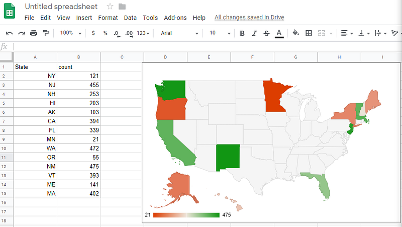
Google Sheets Maps: Not as magical, but still pretty magic
Making these maps is a high technical feat, you have the crazy map outlines to deal with, there’s usually AI/ML involved in interpreting whether a piece of data is a zip code or some other location, map locations often have duplicated names, data points need to be aggregated depending on the display zoom level… So having all of that work abstracted for you is a huge amount of value.
Conclusion — spreadsheets make good throwaways
To the extent that spreadsheets need to be maintained, they represent a form of technical debt. The trick is to not let it be technical debt, by avoiding the use of spreadsheets as long-term living documents. While we’re often trained to not generate throwaway work, paradoxically, spreadsheets are almost ideal for fast throwaway work. It’s often when we keep them around that they become an eldritch horror.