

Over-simplified metrics suck
Over-simplified metrics suck
I want MORE damnit!

This bi-weekly paid subscriber post brought to you by all the frickin’ plants spamming allergenic reproductive bits into the free airstream. 😡

The past couple of weeks, I’ve been feeling very miserable with cold-like symptoms in the nose and throat that I can’t quite be sure if it’s allergies, or some plague. My least favorite game since 2020. Since it’s late spring and very warm outside, I had a hunch it was my allergies acting up, so I visited Weather Underground to see what the pollen count was — an angry red “VERY HIGH”.
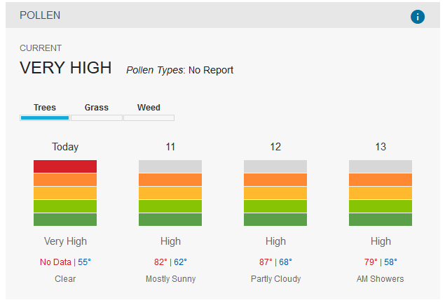
If you click on the info bubble in the top right, it says “A measure of how much pollen is in the air in a certain area at a specific time. It is expressed in grains of pollen per square meter of air collected over 24 hours. Pollen counts tend to be highest early in the morning on warm, breezy days and lowest during chilly, wet periods.”
Great! Informative? Except the display has no signs of the grains/square meter measurement that I could find. It’s not even in a hover tooltip or anything. Everything’s just been bucketed up to make it more acceptable. I also can’t find any description of what the various levels mean.
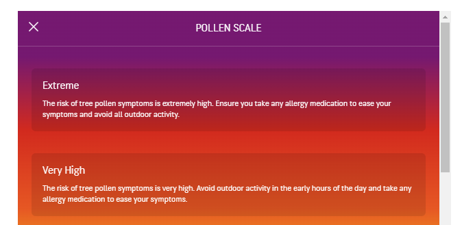
Meanwhile, at the competitor Accuweather (which I believe is ALSO owned by IBM), they have a similar 5-level scale, but it starts at low and goes to “Extreme”. Today only counted as “Very High”. But at least that site provided a rough guidance for the levels mean. The levels are a guidance on the risk of having allergy symptoms and they recommend taking medication and avoiding activities at certain times when things get bad. It’s a marked improvement in usability, but they also neglect to provide numeric data.
On one level, I can understand how bucketing things this way is useful from a user perspective. My understanding is that pollen counts involve humans staring at collection plates under microscopes manually counting the things they see. Such methods are inherently subject to all sorts of sampling and measurement noise, so the difference of 1 or 10 grains of pollen per square meter probably isn’t a big deal, especially over a wide forecast zone. A random uninformed user like myself, if presented with a number like 205 grains/square meter, would ask “so is that bad?”. The buckets provide valuable commentary from someone experienced in analyzing this data as to whether something is good or bad.
But once a user goes beyond being simple and uninformed, these buckets get in the way. My allergies to pollen are pretty bad, so I’m usually miserable by the time things are “medium”. Having the actual counts over time would actually help me learn at what concentration I will feel miserable. It’s great to make the UX easier for when I don’t know or care about pollen counts, but I really dislike having that information withheld from even the more obscure power-user parts of the site.
I want room to grow
Maybe I’m a weirdo with my weather information, but if I’m going to look at a piece of information on a semi-regular basis to make decisions about what medication I need to take, I’d like to learn during the process. It’s interesting to me to learn what makes me miserable and maybe even learn if I’m getting more or less sensitive to allergens over time. I can’t do any of that with these quantized “suer friendly” values.
Right now, all these readings tell me is “oh, you’re likely miserable today, probably tomorrow”.
I feel a similar amount of frustration with house plant instructions. What is does the “low” in “Low Light” mean? I’ve been murdering various plants for the better part of 3 decades now, and am pretty sure that those light values are meant to confuse me. Most plant-savvy people just describe things in these vague terms because it glosses over the complexity of varying sunlight intensity during the day, how sun angles change over the seasons, and a bunch of very complex biological details. But it also means that if I ever wanted to build a small indoor hydroponic setup from scratch for fun, I’d have to figure things out myself… somehow. They’ve dumbed things down too much.
Incidentally, if according to some document by the University of Melbourne that popped up on Google, the suggested light values are this:
Low – 270 to 807 Lux
Medium – 807 to 1614 Lux
High – 1614 to 10764 Lux
So anyways, this is something to think about when we design data readouts for people. We might have to make things easy and accessible to an audience that generally does not want to care about the details. But we should also be designing for the tiny minority who are actually paying attention and want to know more.
Because why are you trying to annoy your fellow data nerds?!