

Rejecting the null based on a chart
Rejecting the null based on a chart
The dream...


Visualizations are powerful tools. They can express a very clear point about a dataset, and so long as they’re created without any misleading elements, they can speed up understanding of a data finding massively.
So one of the ideal things to happen for analyzing data is to find a single, clear, almost-magical chart that seems to change the world for anyone who looks at it. These charts are very rare, you’ll be lucky to make even a handful in a single career, but they’re amazing when you stumble upon one.
One such magic chart
This is a wonderful comic from xkcd December when the results of the Moderna’s vaccine Phase 3 trial results were released:

For quick background, the CDC had released their summary of Moderna’s COVID-19 vaccine on Dec 17th, and on page 28 there's the following figure, which the xkcd comic is making reference to:

Explainxkcd also has a nice explanation of the context for the comic.
The red line being the cumulative percent of trial subjects who had received the mRNA vaccine had become infected with COVID-19 over time, versus the blue placebo line. Since the two groups were randomized (we assume in a proper unbiased fashion), it provided an extremely clear illustration of how the vaccine protected one population from the virus. Even without squinting at the Y axis scale, you can tell that the red and blue lines are doing something markedly different. You can tell there’s an effect with a glance, while finding the effect size takes more examination.
The chart mentions a 91.6% effectiveness for the vaccine with a 95% confidence interval of (85.5, 95.1). But the effectiveness percentage is not important for my purposes here. The chart by itself, if the underlying data is honest, shows the effect without resorting to statistical argument. The two groups differ wildly in outcomes, and since the groups are supposed to only differ by the treatment, we can conclude that the treatment is very likely to work.
As the comic quips, “we reject the null hypothesis based on the ‘hot damn, check out this chart’ test”.
Sure, you need to do actual statistical analysis and calculations to get the actual efficiency and confidence intervals, but the overall conclusion that “Something is going on here” doesn’t change.
Tons of hard work made the chart possible
Before the first average was ever calculated for the study, huge amounts of hard work had been done to set up the experiment. Protocols were established (see page 12 of the summary), including what participants were in included, what constitutes the point where they measure efficacy (preventing a protocol-defined infection of COVID-19 >14d after the second dose), and a bunch of other details.
Then once all those protocols were designed, there’s the huge logistical effort of picking participants, randomizing them, administering the treatment and placebos, and then tracking all the participants throughout the study. There’s huge amounts of coordination, data entry, management and logistics involved.
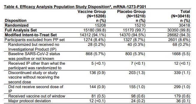
Take a look at the table detailing all the participants that had to be excluded from their analysis because something went wrong. 12 people were removed from the data because they got the wrong shot than had been assigned in their randomization. In the internet analytics that I normally would do every day w/ we’d just shrug and accept that 12 people were in the wrong buckets and not care. But this study tracked and threw out those data points.
There are plenty of other tables in the study too that show lots of careful participant data tracking to make sure that things like age, gender, even race and comorbidities were tracked and are quite balanced in both groups.
Then, as the data trickled in to the researchers, they obviously did their analysis and amongst all the other work they did, they developed that fairly simple visualization to illustrate the main point — that the vaccine works.
When does “deciding via chart” even work?
As a rule of thumb, these are the heuristics that I use, in increasing importance:
The chart isn’t misleading
The underlying data is actually of good quality and well analyzed
The effect sizes you care about are relatively huge
It’s easy to make a misleading chart, even accidentally. There’s countless subtle, and not so subtle, ways to fabricate the appearance of an effect where it doesn’t appear. So it’s a pretty important requirement that the chart is presented in a fair way.
Data quality and good analysis is necessary to make sure things that are being said by the chart are actually things the data is allowed to say. Very often, you need to do a lot of careful controlling and separating groups out in order to make a chart really speak to a given effect. Maybe the treatment only works in certain countries, or in certain times of the day, or in cats but not guinea pigs. These caveats need to be expressed clearly.
Meanwhile, data fabrication and other forms of fraud is even a problem in academic research where there is ostensibly some peer review and replication going on (obviously those checks alone aren’t enough). The business world doesn’t even have those flimsy safeguards against dishonesty. Much of it is based on trust that the analyst did their job correctly, and no one noticed any inconsistencies. It’s fertile ground for an evil data scientist to do some fraud.
Finally, what effect sizes we’re looking for matters. The smaller the effect size we’re interested in, the more statistical power we need to make a decision. It takes very few observations to know that falling into molten lava is fatal, takes some more observations to see that people have a bias to turn right when entering buildings that seems to apply more or less strongly depending on situations, and it takes more observations still to determine if a new vaccine is effective or not. Having small effect sizes also often requires having more complex models to isolate noisy data effects, so that you can hopefully find the effect you’re looking for.
But big effect sizes, like the ones a startup company is looking for, 50%, 100%, 200% increases in activity and revenue are much easier to detect using even crude statistical methods. The best way to know which side of an A/B test is winning is the side that’s generating so much money you’re too busy counting the money.
Those giant effects should be observable on various basic metrics charts without a lot data massaging. Imagine a 50/50 split test that magically tripled revenue for the treatment arm. That’d mean that even if you did nothing but look at aggregate revenue, you’d see a 1.5x increase overall because half the universe saw the treatment. You’d notice that really quick. If the effect holds up for a week or two (to account for weekly seasonal effects and effectively increasing the sample size), you’d be increasingly confident it’s the treatment causing the revenue boost. All this is something a layperson with zero stats training can do.
Sidebar: Yes, on the back end, this is effectively running an implicit hypothesis test with sample size controls and everything, but outcomes are so outsized and “self evident” that no one feels a need to use a formula for any of this.
As Cassie Kozyrkov, Head of Decision Intelligence at Google, often writes, statistics is about making decisions under uncertainty. It’s the methods and formalized statements of assumptions that help us make decisions when we don’t have knowledge of everything. The more sophisticated we are stats-wise, the more we can use interesting assumptions and the properties of probability and math to make stronger arguments for deciding one way versus another. But when we don’t have that sophistication, we can still stick to very commonly used, robust methods and make things work.
With “just” a “simple” chart.
Various Updates
Shops and stickers
Working on it >_<. It’s Perf season at work and things are a bit nuts.
The main goal is to get a quick 1-pager site up where I can post the stickers I’ve printed up for sale, while also putting a couple of my favorite photos as prints. It’s sorta an outlet for any of the artifacts I make in the course of my wandering hobby addiction.


I’m also doing all I can to avoid using WooCommerce + Wordpress because it just feels so… WRONG… to run a web store order processing system that’s been shoehorned into a blogging platform. At the same time, a lot of the tools and integrations that I’m interested in don’t seem to be available for OpenCart, nor do I want to install something massive Magento.
*sigh*
It’s also not worth the time and money to use any of the web shop hosting services. The monthly fees alone would far outpace anything I sell.
Business is hard, yo.
About this newsletter
I’m Randy Au, currently a quantitative UX researcher, former data analyst, and general-purpose data and tech nerd. The Counting Stuff newsletter is a weekly data/tech blog about the less-than-sexy aspects about data science, UX research and tech. With occasional excursions into other fun topics.
Comments and questions are always welcome, they often give me inspiration for new posts. Tweet me. Always feel free to share these free newsletter posts with others.
All photos/drawings used are taken/created by Randy unless otherwise noted.