A couple of weeks ago, a reader reached out to me to see if I wanted to look at the data tool that they’ve been working on and give my thoughts on the whole thing. I won’t link to their tool since it’s in a private preview state, has some rough edges, and I haven’t asked for permission to openly discuss it. Luckily, that information isn’t relevant for this week’s post, because I’ll be talking more about the methodology.
Two years ago, I mentioned that I was running a dogfooding project at work to teach my UX colleagues working on Cloud infrastructure products. The goal was to help people who never would have a need to even think about cloud infrastructure understand just what it is they were working on, by giving them the experience of watching someone build infrastructure and even hands-on attempting where practical.
It’s been two years now and I’m still doing a version of that program with my team today. It’s just changed because there’s only so many “big all-encompassing infrastructure projects” you can do without getting repetitive. In our case, we made scripts that faked IoT sensor data and fed it into the beginnings of an analytics pipeline. We also recently ripped all the sensors apart and made them run on Kubernetes — one heck of a learning curve for us.
But nowadays, since the team has a better sense of what “infrastructure work” looks like, we’ve gone on to just using specific products and doing our best to use every last aspect of them, just to see if we can do it. This means we’ve started having more “artificial” situations and sometimes are just doing a full product teardown and learning from the complexity involved in getting advanced features to work.
This means the methodology has slowly shifted from a lot of live infrastructure-ing, explaining obscure tech concepts to the audience and writing a journal of events afterwards to something that even more resembles a self-narrated usability session, or perhaps “friction logs” from the DevRel community.
Doing your own self-narrated usability study for the benefit of others
There are myriad ways of giving feedback, but in my attempt to maximize the information content I can transmit to people as I work through a product, I’ve settled upon a way to narrate what I’m thinking and working on as I struggle through operating an alien product.
The method is fairly simple — open up a notepad or start recording yourself and your screen and open the thing you’re attempting to use. Then every time you try to do something, write down what you’re trying to do, how you’re trying to do it, and whether it worked. Repeat.
Pretty much every moment you’re actively doing something, even if it’s struggling to understand what is happen, it is worth writing down. You’re not giving feedback about what you think is great or not, you’re literally retelling the journey that you’re taking in using the product as you go including all the bumps and dead ends. It’s up to the reader, not you the writer, to synthesize that journey into something useful because they will have more context about how to fix things than you do.
Here’s the things I typically keep in mind when I do this sort of work:
In any usability study, the researcher is often trying to understand what people are thinking about. They learn how to prompt and guide people without leading them too much. The goal of self-narrating is to provide this without anyone prompting.
Context IS the value you’re providing, so include as much as you can. Write more than you think is necessary because you’ll never re-live the same product experience twice. You can edit it down later.
Always say what you’re trying to do, where you’re looking when thinking, what you’re expecting to find, and whether you found it
Be up front about not reading instructions or messages. If you didn’t bother to read the manual, tooltips, instruction text (yes, I’m sure YOU read it but no one else ever does), don’t hide it now. If you actually read it and can’t understand it, that’s also important information to share.
If you’re referencing a 3rd party blog or Stack Overflow post, link it because sometimes those sources are outdated or flat out wrong.
Mention the good as well as the bad.
Remember that there’s designers, engineers, writers, and other humans who all personally worked on the thing you’re testing and will be reading the text afterwards. So while it’s fine to express your confusion and frustrations, pay some attention to how you word things.
An example of the note-taking
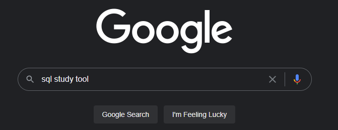
As an example, I’m going to head to Google, click enter “sql study tool” and hit the “I’m Feeling Lucky” button and go through wherever it takes me for a couple of minutes.
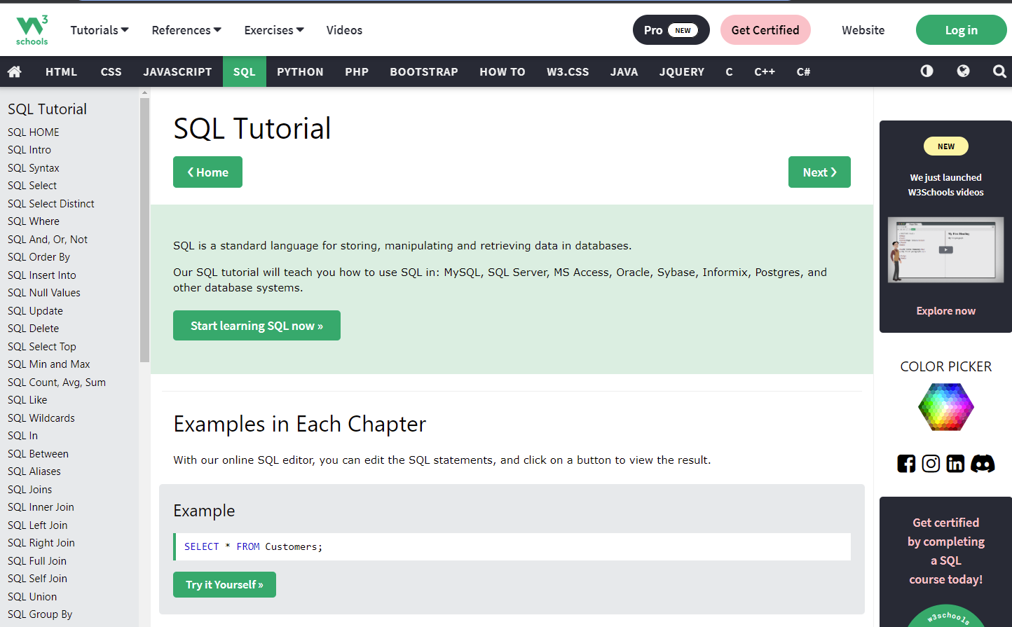
Today it’s landed me on w3schools.com/sql, which seems like a respectable place to learn SQL for someone who has never heard of it before (aka. so very much not me).
But here we go! Let’s be a user and see what happens!
I quickly scan the big green box and note the "Start learning SQL now" button... Except this is the Tutorial page already, and there's even more content below. Has the tutorial already started? I also note the example with a prominent "Try it Yourself" button and I'm tempted to click to see where it goes.

Also, what's with the "Home" and "Next" buttons near the top? Where does "NEXT" even go? ... Oh, on the left there's an index and hitting next would probably follow that outline.

I briefly note that the top nav has some buttons on it for logging in and some nonsense about certification and "Pro"... whatever that means. It probably involves money. I'm not interested and scan lower in the page for more interesting things to see.

Scrolling down there's headers for things like SQL Exercises (test questions), SQL Examples, SQL Quiz Test, SQL References, etc.. So this page I'm on is NOT the tutorial page but actually a kind of table of contents. It's definitely not clear. I would've expected to be sitting an Intro page right now but the left nav indicates that's the next section.
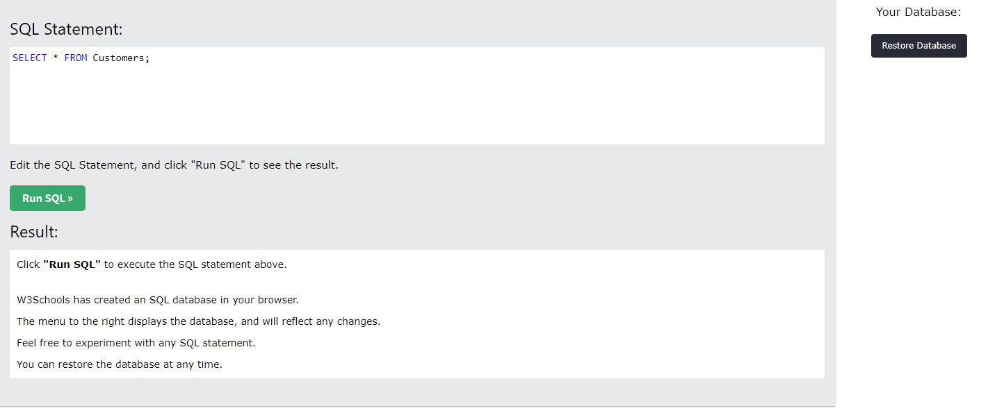
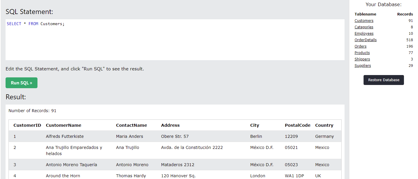
Curiosity gets the best of me and I click the "Try it Yourself" button near the example. It instantly throws me into a SQL console-like place. I see a query up top, a results box on the bottom wher eit says it's created a database in my browser (so I guess it's using SQLite?) There's also a black button on the right for restoring a database in case I mess up.Running the query already in the box does two things. Pulls out a table of customers in the bottom, which I was expecting. What surprises me is on the right, it suddenly lists out all the tables in the database. I had been wondering how would I know what tables exist in my browser-database and the question is answered for me.
I notice the tables on the right side are links, so I click on one. I pretty much expect it to generate a Select * statement in the top SQL box, which is does.
BUT, it ALSO seems to automatically submit the query and execute the statement to show what's inside. That saved me a whole click! YAY!
There's only 10 rows in the table, plus it's a demonstration sqlite database so there's not going to be a billion rows in any table. But it makes me itch that there's no default LIMIT statement in there.
Also the table is written as [Employees] with brackets. Is that a SQLite thing? (Apparently yes, also an Access/MS SQL thing)
When toying with the SQL tool and some simple queries, I try using ctrl+enter to try to execute the query without having to use the mouse, a common feature in most SQL clients. Sadly this page doesn't support that functionality =(
I do feel the db actions are insanely fast (which makes sense for a tiny SQLite database running completely in memory). It's a big change of pace for waiting for a giant distributed cluster to spin up and churn through tons of data.Finally, having played with the SQL tool to get a feel for it, I hop back to the original page and click to start the Tutorial. Where it starts explaining what SQL is, and other details that I don’t want to read tonight, and thus we’re at the end.Making it useful for others
Once I have my raw notes down, I’ll then go back and convert them from “whatever I was thinking at the time” to something more consumable by others. Sometimes thoughts and situations need some elaboration to make sense. Other times, I probably wrote something really harsh/offensive/gibberish that needs to be toned down in retrospect.
Occasionally, I’ll break temporality by inserting notes like “I couldn’t find the Format SQL button! [Oh, I found it later once I realized there was a right-click menu]” just to highlight that I was probably doing something silly and found my own mistake later.
In the end, the goal is to provide a relatively readable tale of what happened. Since I’m very likely NOT using the tools as the designers originally intended, I’m sure that’d at least get them thinking outside of their own personal familiarity of the tool and consider what's going on in others heads.
Getting them thinking is about the best we can hope to do, given that we're a data point of one.
Standing offer: If you created something and would like me to review or share it w/ the data community — my mailbox and Twitter DMs are open.
About this newsletter
I’m Randy Au, Quantitative UX researcher, former data analyst, and general-purpose data and tech nerd. Counting Stuff is a weekly newsletter about the less-than-sexy aspects of data science, UX research and tech. With excursions into other fun topics.
Curated archive of evergreen posts can be found at randyau.com.
Join the Approaching Significance Discord, where data folk hang out and can talk a bit about data, and a bit about everything else.
All photos/drawings used are taken/created by Randy unless otherwise noted.
Supporting this newsletter:
This newsletter is free, share it with your friends without guilt! But if you like the content and want to send some love, here’s some options:


