Time is annoying? Time durations are worse!
Shocker: Stretching a painful thing out doesn't make it less painful!?

The library in the Canadian parliament is pretttttty
Thanks to @fabiansteuer for sending me a couple of data questions a couple of weeks ago that sparked this week’s post, and allowing me to give credit to the source. I usually rearrange the questions to be more generic for various privacy reasons, so it’s also cool to ask me questions but remain anonymous in the event I write about it.
The question of the week is about how to handle time frames. The specific context being how to analyze user behavior over longer periods of time, more than “a single session”, potentially more than even days, or months. (Also, I need bunch of articles to rant about the pain surrounding concept of ‘sessions’, but that is best left for another day).
So, why do we care about working with time frames?
In a tech product context, we’re often interested in “how are people using the product”. The point is to analyze user activity data for patterns, and then tell a persuasive narrative about what people are doing, hoping the insight can be used to make product decisions.
With an insightful story in hand, we can make improvements to the product, or at least be comfortable in the fact that our product “appears to be functioning healthily and correctly”. I’m deliberately calling it a “narrative” here because it’s impossible to know exactly what people are thinking and doing just by watching aggregate metrics alone.
We’re at best capturing a small, distorted, snapshot of true reality with our research methods. We then attach stories to the data to generalize things for making changes. Quant data is involved, but often qualitative research, and a bunch of stuff is used to build up this story.
This work is often done at a tactical level — we look at how often users use a certain feature, how many people who saw a given page convert, etc. The time frames are very often within a day, or even within a single user session which is usually less than a day. The definition of session varies but let’s assume the Google Analytics standard session definition of lumping all activity that’s within 30min of the previous action ‘part of the same session’.
The time constraint comes from two distinct reasons. First, the actual object of study often has a short time frame, e.g. you’re not usually expected to take 3 months to open a single email.
Second, it’s easier to work with short periods in terms of sheer volume of data and processing. If you’re generating gigabytes, or even terabytes of data every day, the difference in processing time between 1 week of data and 1 month, or even 1 quarter, is massive.
It’s usually not hard to tell some kind of narrative looking at these fairly tight time windows. For tasks that are expected to finish in a single sitting, they work quite well.
An example is a simple registration flow on an everyday e-commerce web site. You’d normally expect such a reg flow to take less than a day. It’s a familiar experience to users, there’s no big cost up front, no complicated steps, etc.. It might take at most a whole minute to complete from start to finish. This stuff is generally easy to analyze, even if you have a long tail of users who occasionally a few days to complete a registration, you can usually safely ignore those.
So what’s the problem with longer time periods?
Lots of problems.
Out in the rest of the world, this class of analysis falls under the variations of name Longitudinal Data Analysis. I’m sure there’s other names for it in other fields somewhere, but the most cited literature comes out of various medical and sociological fields, where longitudinal studies have gone on for generations.
It’s a tough problem that requires a lot of thinking and design to work. Just browsing overview articles like this lists the many broad classes of issues you need to worry about when dealing with longitudinal data.
Time needed (duh)
Correlation/covariation - within subjects, between subjects, confounds
Measurement differences and changes
Uneven sampling leading to bias
Irregular measurement timing
Handling missing data/dropouts
These are very high level issues. You’ll find more issues as you dig deeper into the actual specific mechanics.
What’s also different is that the traditional methods designed for longitudinal studies are for their respective fields, medicine, sociology, etc. The assumptions they carry might not translate one-to-one with our industry setting. They do things certain ways because they’re only able to collect data a certain way, our limitations are usually different.
So, what’s the minimum we need to do?
I’m not an expert on this topic by any stretch, but there’s a few very obvious pitfalls that have bitten me in the butt before that’d be a good idea to share.
You’re going to have cohorts
There’s no real other way to do long term studies without chopping up your population into cohorts of some sort to study.
You can’t just start comparing different people to other people over long periods of time blindly. It’s often not a useful to compare a user that has registered 15 years ago to one that has registered 15 hours ago. For one thing, the first user had 15 years of time to randomly stumble upon any action of interest you’re interested in.
Moreover, a user that signed up and has remained active for 15 years, is one heck of a survivor, and probably made up 0.01% of the entire cohort that registered 15 years ago. It’d be like comparing an active Livejournal user from the late ‘90s to a new user today.
As a practical matter, the exact size and makeup of your cohorts will be a balance of the amount of data you have. Maybe you look at users who registered all on the same day, or week, month, year.
You want your cohorts to be as BIG as possible, to have enough of a sample size to counteract user attrition over time. For many things, it’s pretty common to see 80%, 90%, even 95% of a cohort drop off after a month or two of time. If you started a daily cohort of 100, after 6 months, you might have 5, or 1, or none left. This also means you want to be very conservative when deciding whether to further segment cohorts.
At the same time, you want the cohort time periods to be as TIGHT as possible. If you’re using daily cohorts, you only have to wait 1 day before the next cohort ages up to be comparable. But if you’re using monthly cohorts, you’ll have to wait a month, possibly 2 depending on how you’re handling fractional months. Yearly cohorts take a year. You can see how this can get pose a problem when you need an answer ASAP.
It’s impossible to find a perfect balance, so you have to pick, test, and choose.
You’re gonna need a TON of consistent data
Let’s just admit it up front, I work in tech and primarily startups. We often don’t think months and years ahead. We usually build what works for now and iterate as we go. Traditional longitudinal studies are NOT designed this way!
Since companies aren’t usually wiling to wait months or years for longitudinal data to come in for a study, we wind up doing these studies retroactively using the data we’ve already collected. This poses yet another laundry list of problems you have to worry about.
Since we’re supposed to be comparing cohorts over time, we need to be sure that each cohort is measured in the comparable ways over time. That sounds reasonable until you think about how data systems change over time…
Did your core metric definitions change over time? Can you recalculate everything to be consistent?
What has changed significantly over the years? New customers? New markets? New features? New competitors? Different business model?
Has there been any bugs that affected your data?
Have you lost any data?
Has your metrics instrumentation changed over the years?
With a lot of thinking, trial and error, you should be able to squeeze information out of a massive pile of historic data, but it’s a journey.
I’ve had some luck by focusing on the most business-critical systems as a data foundation. For example, official revenue-tracking data tends to be checked and debugged more rigorously than most other systems, so it’s more likely to be consistent over time. Leverage similar systems. Everything else is a bit of a crap shoot.
So, in practical terms, you’re surprisingly limited by how smart and forward-thinking you and your predecessors were a long long time ago.
Good luck with that.
Lean hard on normalization and aggregation
As time frames get wider, the range of variation users can exhibit explodes exponentially. Fine-grained measurements that work in short time frames becomes senseless. Counting “how many times this button is clicked” works for a single session, but you’ll get intractably wide distributions over a 1 year period.
Doing things like switching to thresholded binary measures (clicked at least 1x, 10x, etc.). Or counting specific behavior patterns (visited pages A, B, C in that order in a day). will help you make more sense. It’s essentially the process used to make features for a large regression model, where converting an interval measure into an ordinal or binary actually makes things easier to work with down the line.
How about tooling? Visualizations?
I don’t do a ton of viz work, so there’s probably better ways,
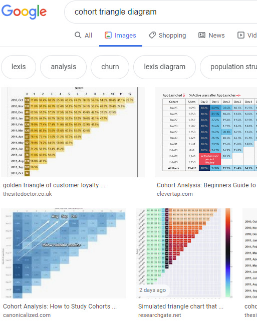
Triangle diagrams of cohorts are very useful and are relatively easy to make:

You get used to squinting and looking at diagonals to identify product changes. Good coloring contrast is key.
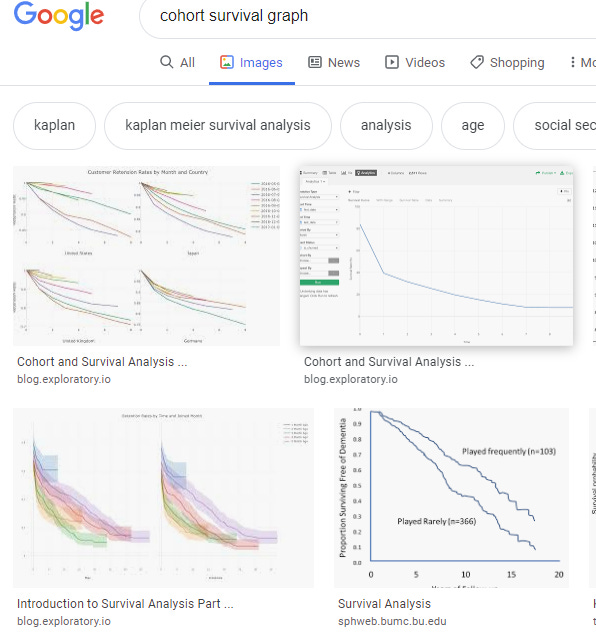
Various survivorship/retention curves are also useful:

But you have to be careful because they tend to look like spaghetti without a lot of tuning. It’s usually very hard to pull meaning out of them without a lot of slicing and experimenting.
Charts are nice and all, but what about tools?
Modern analysis software like Tableau, Amplitude, Looker, etc. have functionality built in for cohort analysis. You of course have to set things up properly, and it assumes the data has been collected and cleaned enough to be usable, but the base functionality is there to explore.
But the hardest part about cohort analysis has always been making sense of the output. Overcoming the ridiculous data hurdles is just the first (but significant) painful step in the process. Even that step pales in comparison to staring down 25 squiggly, colored curves on a line chart all sloping similarly and pulling a story out of it. Expect to do a ton of detective work and sideways thinking to pull it off.
Also, there’s never a guarantee that you’ll FIND anything with cohorts either.
Which is why we’re all still struggling with this stuff.


